
Cars Logo with Stand
Obliczymy ostateczną cenę na podstawie wybranego pliku. Sprawdzisz ją i zaakceptujesz przed płatnością.
Zapisane na tym urządzeniu.

This model is a version of the world-famous Cars logo, from the Disney franchise with the same name.
- Ocena
- 0 / 5
- Polubienia
- 48
- Pobrania
- 206
- Wydruki
- 1
- Wyświetlenia
- 1129
- Oceny
- 0
Aktualizacja u źródła:
Informacje o modelu
- Źródło
- Printables
- Kategoria
- 2D Plates & Logos
- Licencja
- Creative Commons — Attribution — Noncommercial
Summary (Continued):
This model has multiple printable pieces that result in an easy, fun assembly process. At the end, gaze at your logo with pride, as it stands up on any desk or table with its built-in stand! With overall dimensions of approximately 19x13x7cm, this part fits inside a cube of 1746 cubic centimeters. I designed this part with Prasoon Paul, and you can find his version of the part here (https://www.printables.com/model/643392-cars-logo).
Problem Statement:
With a partner, you will design a “2D” placard using Solidworks. You and your partner will have the same design which meets the constraints below, and you will EACH use Solidworks to create your design.
Parts & Assembly Instructions:
Parts List:
1xDish/Stand
1xRight Tip
1xLeft Tip
1xBottom Tip
1x Cars Text
1xCars Text Background
1x"A" Background
1xEmblem Border

- Fit the “Cars” Text into the red background. Note that elephant’s foot may cause these pieces to not fit exactly, so some sanding may be required.

2. Fit the background piece that goes inside the “A” into the text. Note that elephant’s foot may cause these pieces to not fit exactly, so some sanding may be required.

3. Take the completed emblem portion and fit it into the dish. Ensure that when you fit it in, you hear a popping sound that signifies the pieces have latched together. Note that due to the shallow depth of the dish, it may be necessary to glue these two pieces together.

4. Take the bottom tip and fit it into the dish. Note that due to the shallow depth of the dish, it may be necessary to glue these two pieces together. Before you glue it, make sure that the piece is properly aligned inside the dish.

5. Take the top left tip and place it into the dish, making sure that it lines up. This piece is small, so it can be difficult to determine which side should go into the dish, but the bottom side will be visibly smoother than the other two. Glue may also be necessary to fasten this piece into position.

6. Place the top right tip into the dish, making sure that it lines up. Like the last piece, this one is small so it can be hard to decipher where the bottom is. Look for the visibly smoother side. Glue may be necessary to fasten this piece into position.

Design Choices:
- We downloaded a font similar to the “Cars” font to produce the text. However, when we tried to offset it, the sketch produced an error saying that the offset could not be completed, and trimming the extra geometry did not help. As it was a large, complex contour, we thought that the problem with the offset could have been due to the sheer size of the part and that there was probably some small intersection preventing the offset.
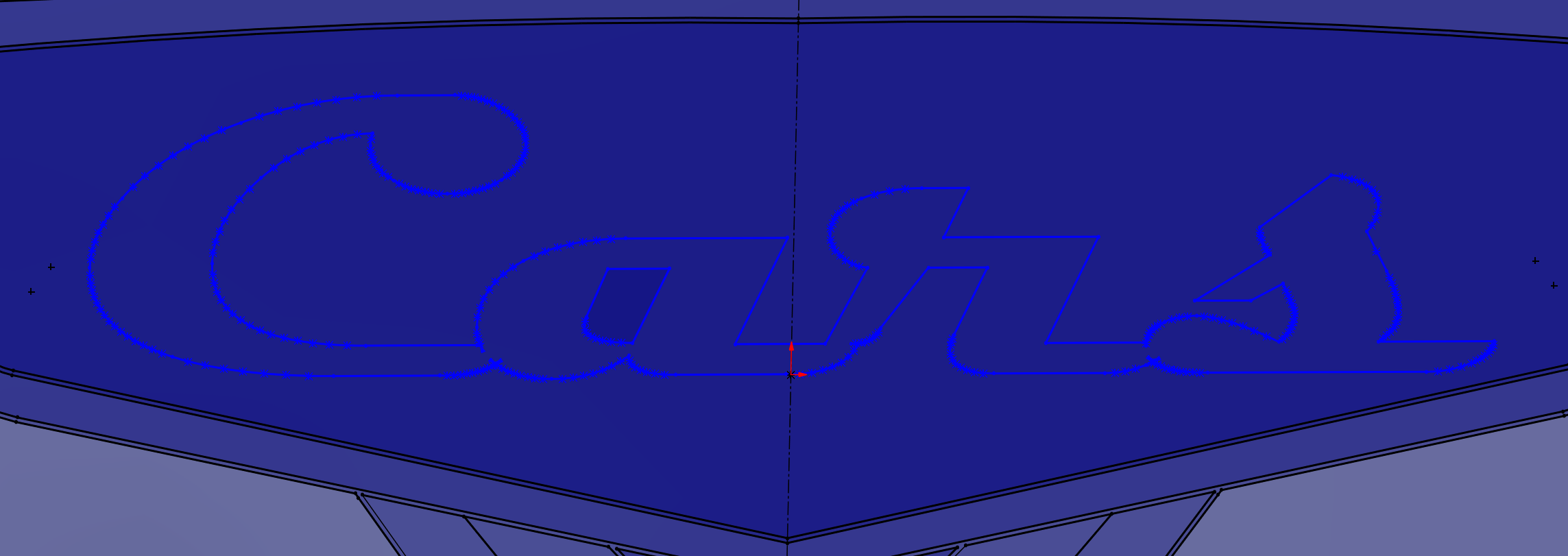
 To combat this, we tried to type each letter individually and offset it individually, but this also did not work as the sketch produced an “invalid solution” error and turned red. No matter how we tried to clean it up, we could not fix this sketch so we decided to abandon it. It was also cumbersome to work with since each letter was done individually, and aligning each letter correctly and sizing each individual letter took a long time.
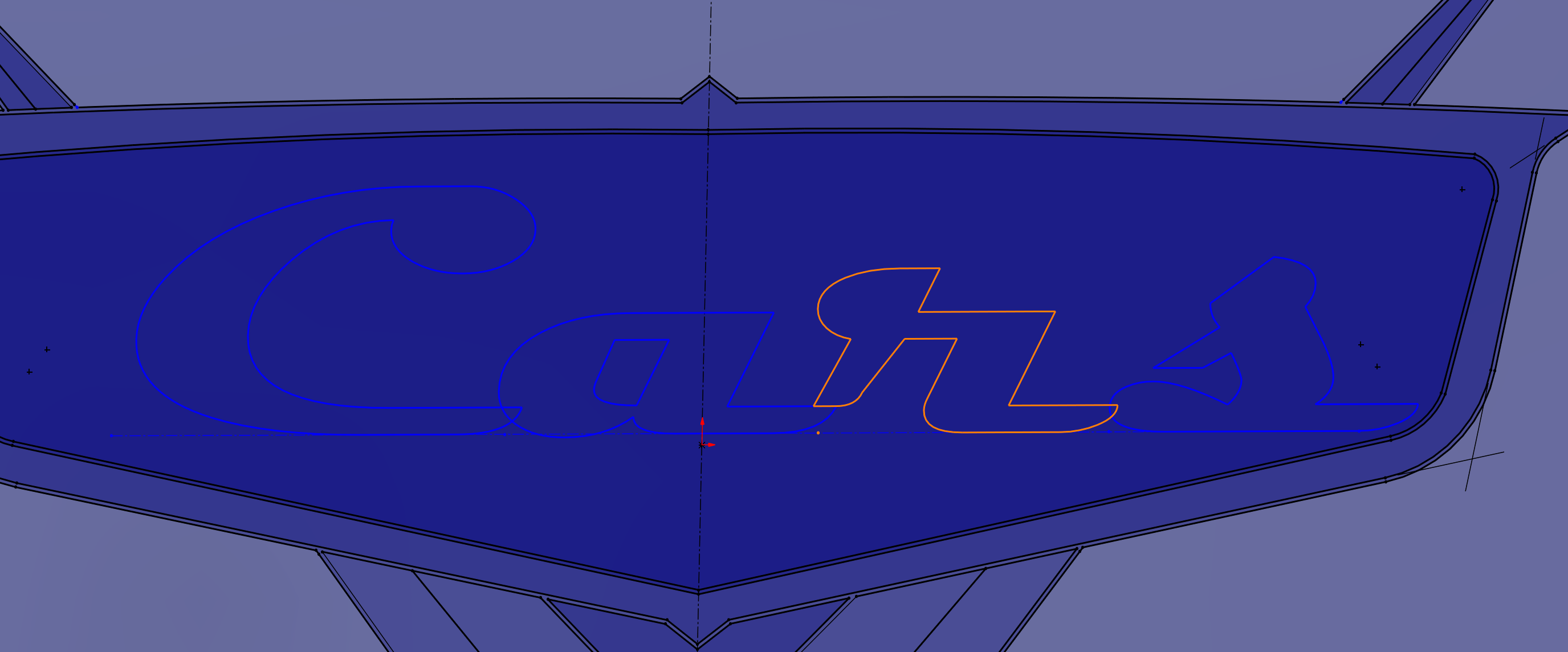
 Finally, we tried again with all the letters at once but we cleaned up the sketch by simplifying the “r” before offsetting, which fixed the problem. In the earlier sketches, there was a spline that quickly cut inwards in a strange contour, and we decided that this was likely to be the culprit. To fix this, we trimmed the spline and drew a line connecting the “r” to the bottom spline and then offset.


- The dish was initially to be a rectangle, as the logo was built inside a constraint box. However, due to the logo’s irregular shape, it would have resulted in an excessive use of filament.

To combat this, we offset the outline of the logo and simplified it. While this looked aesthetically pleasing and both me and my partner were happy with its appearance, we realized that it was not yet ideal.

There was still some wasted material near the top, so we offset the entire logo to create the final dish. While the simplified dish was good-looking, my partner and I both prefer the new dish as it provides a concentric element to the final product.
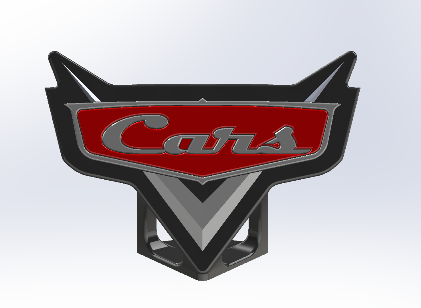
3. Initially when creating the tips, the plan was to bring the centerpoint up in 3D space. However, when we arrived at this step, we realized that there is no good way to move just a point in Solidworks. We originally tried to chamfer the entire pieces but it resulted in something like this:

As one can see, the chamfers did not work to any appreciable extent on the top points. To arrive at the triangular-shaped points, we extruded each piece then chamfered each side individually to the maximum amount possible so that it would create the desired peaks. This was an aesthetic change, but my partner and I both felt that a nice-looking angular element to the points was a necessity.
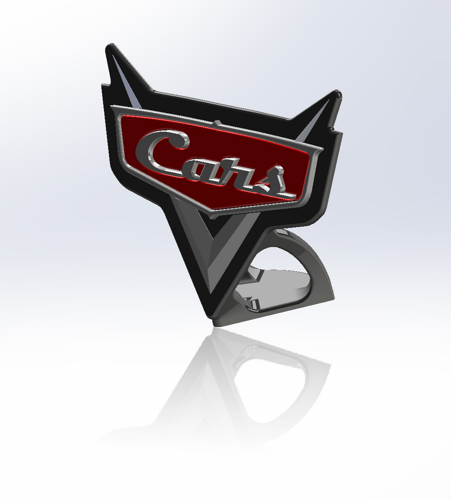
4. The original plan for the stand was to revolve the bottom tip portion of the dish. However, when we tried this, my partner and I were disappointed with how it looked – it seemed haphazard, especially considering the jarring contrast between the bulky stand and thin top section. Additionally, this would have wasted tons of filament, as it would have been a large, solid part.

To save material, we decided it would be ideal to create cuts in the piece and then fillet them to make a frame, as opposed to having a solid block. While the fillets do not add any functional value, they help the flow of the dish into the stand in an organic manner.
